Wheelhouse Philosophy-first early education
Wheelhouse is a philosophy-first early education center redefining how children learn, grow, and belong. Rooted in the Great Northern Catskills and influenced by Reggio Emilia, it views education not as information transfer but as identity shaped through experience. Children learn alongside peers, in relationship with the earth and their community, building a lifelong foundation for social-emotional wellbeing.
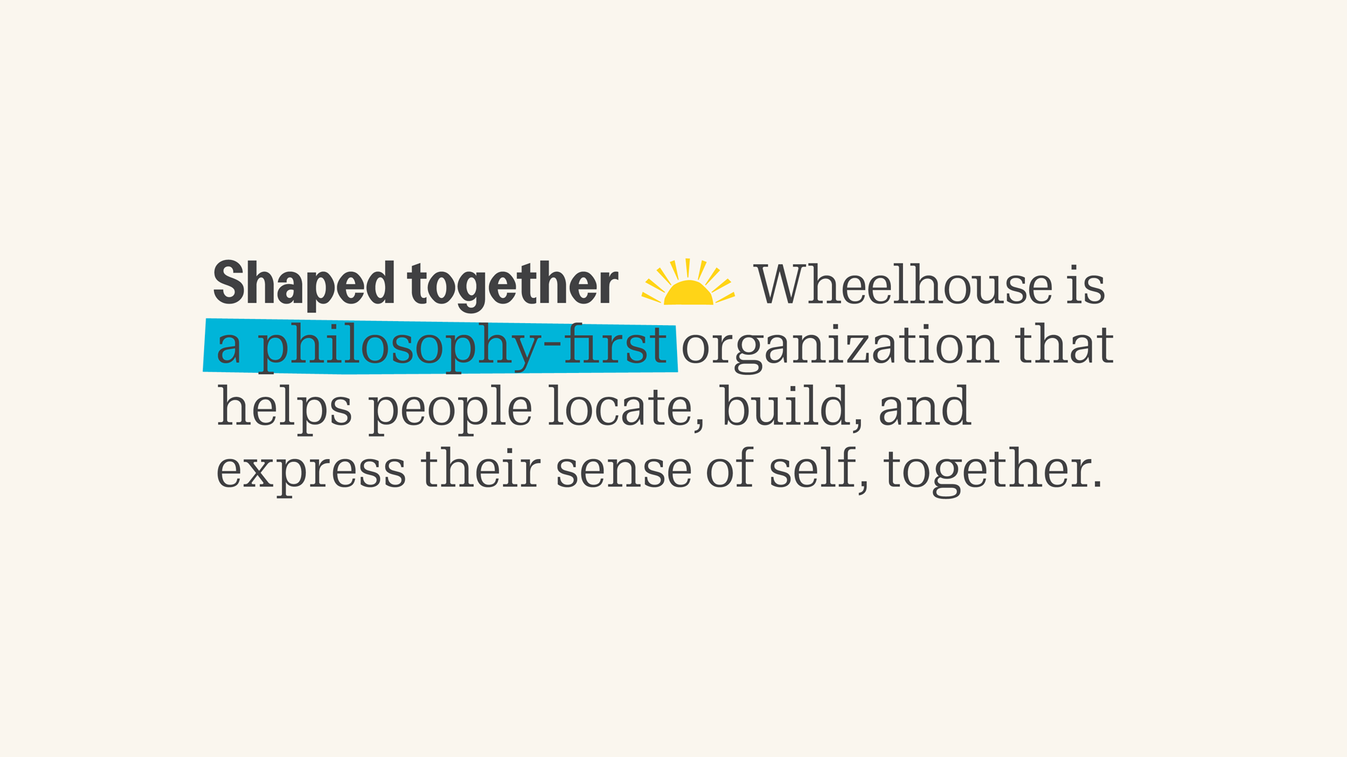
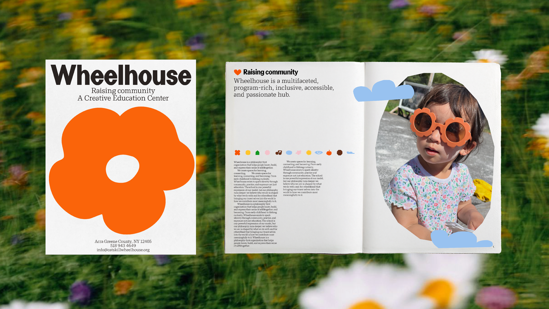
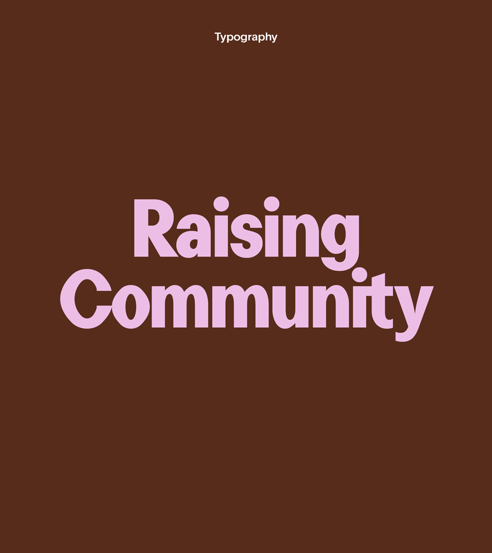
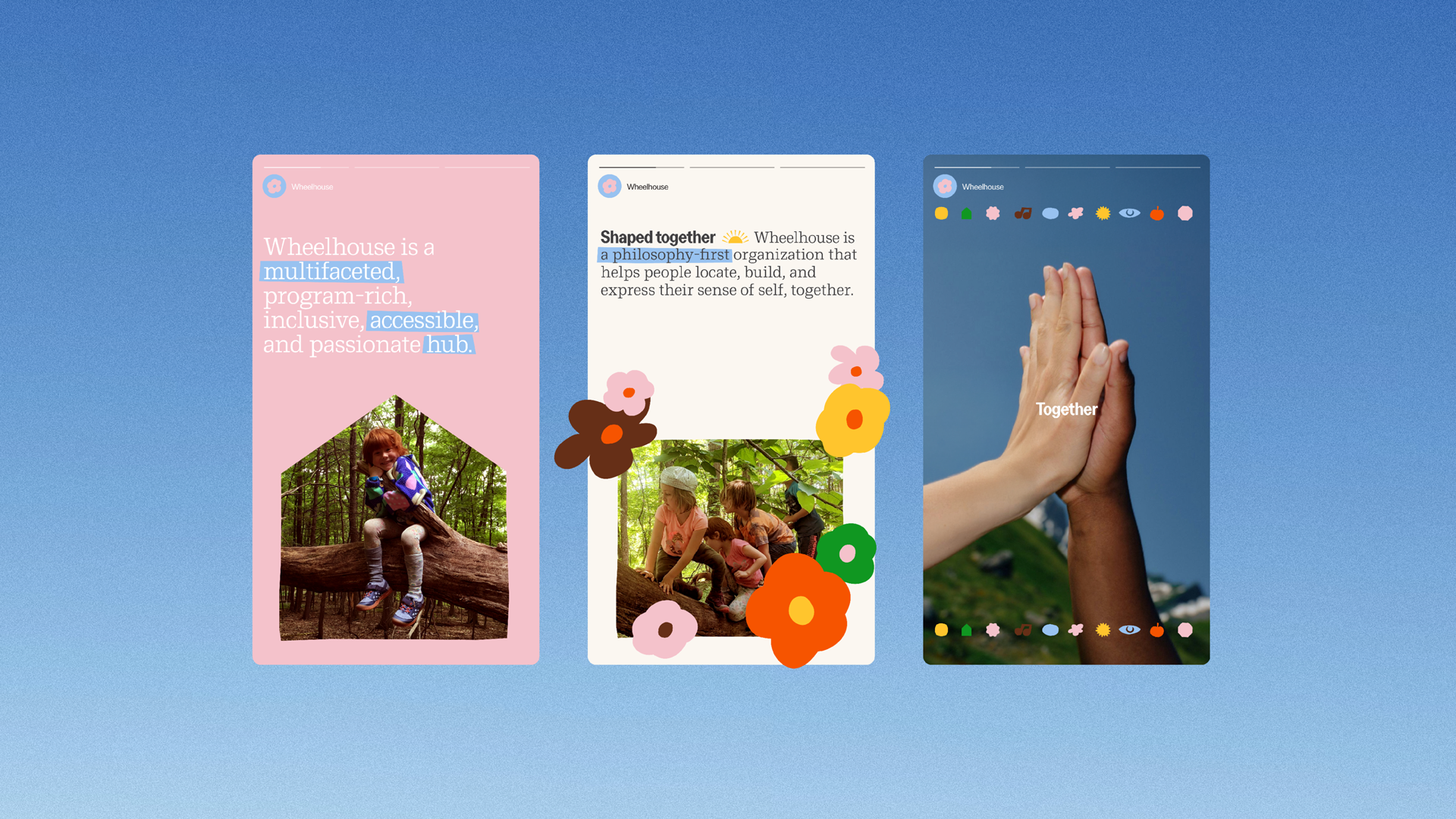
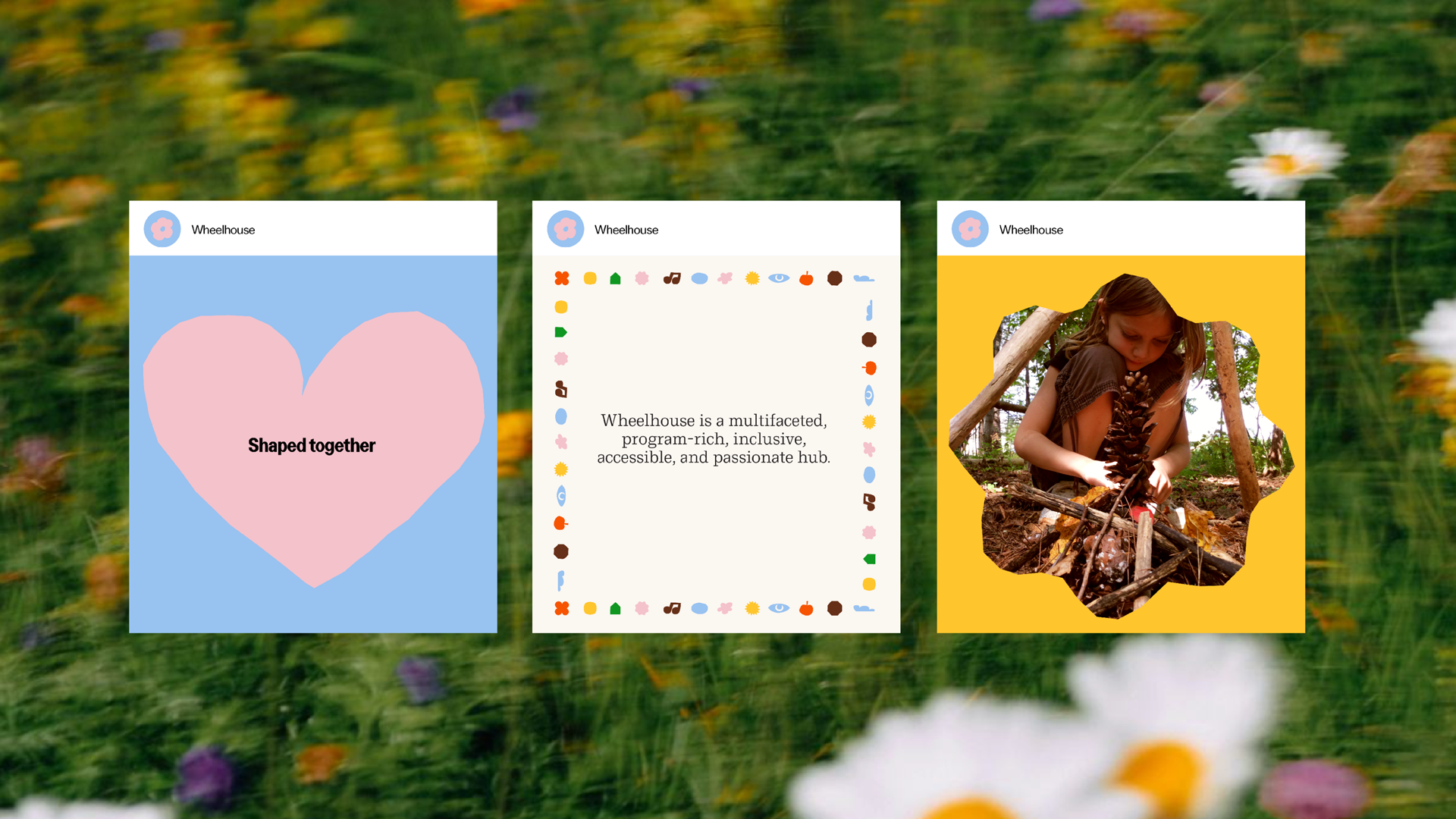
As Wheelhouse expanded beyond its flagship school into a broader cultural model, ABD clarified its positioning and articulated the belief system powering its work. We defined Wheelhouse as a multifaceted, inclusive, accessible hub for raising community, an organization that helps people locate, build, and express their sense of self together. Through strategy, language, and visual framing, we elevated Wheelhouse from a single center to a philosophy-driven movement rooted in collective identity formation.
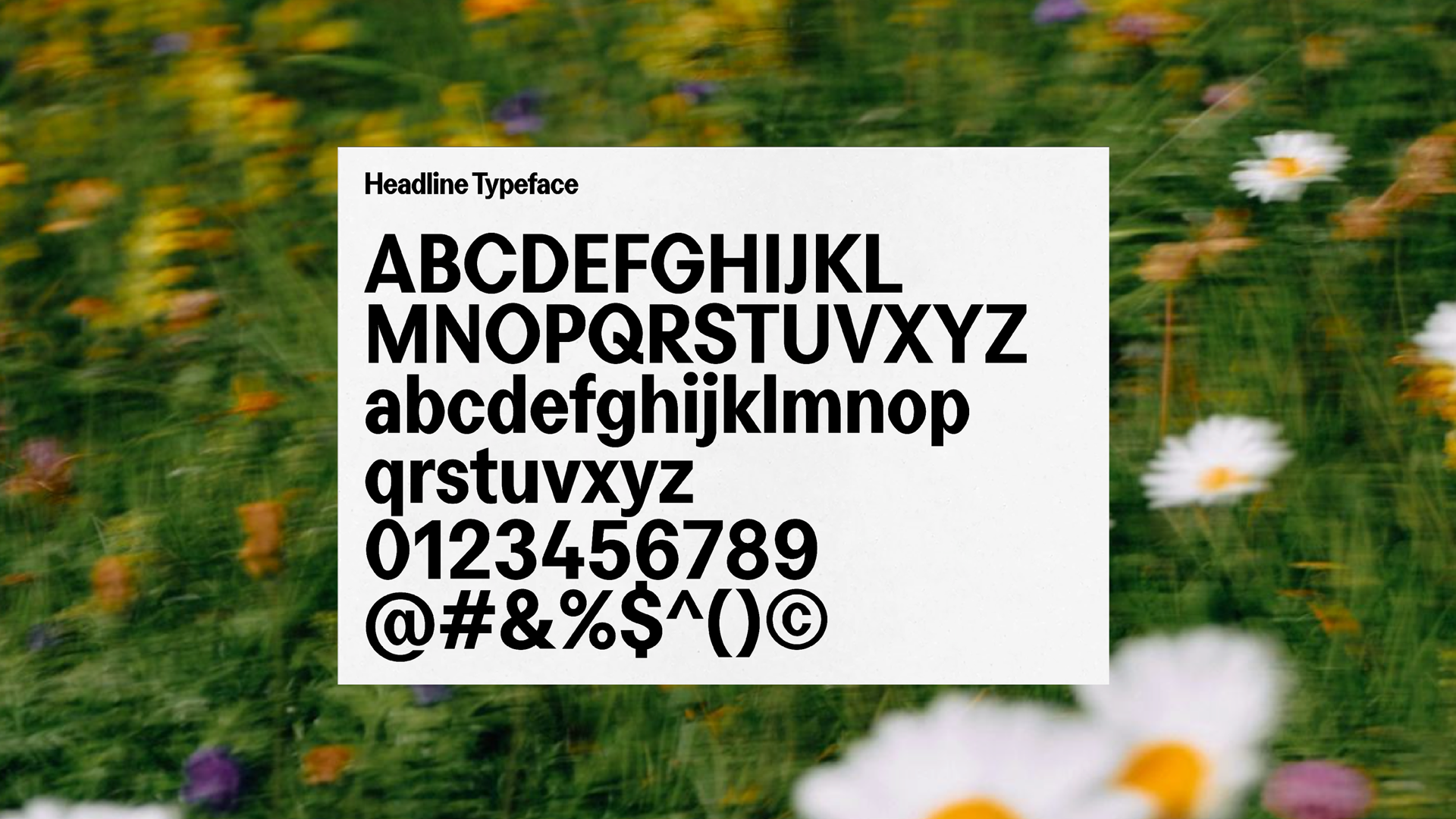
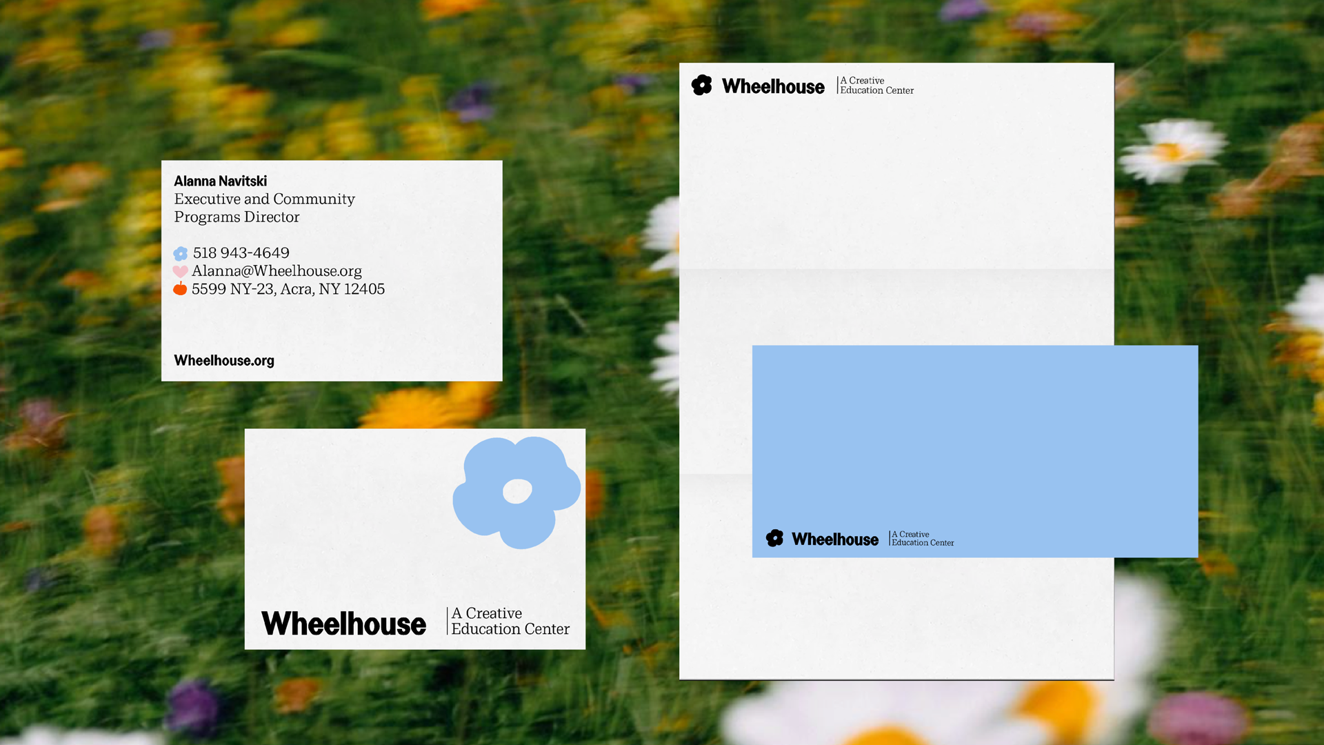
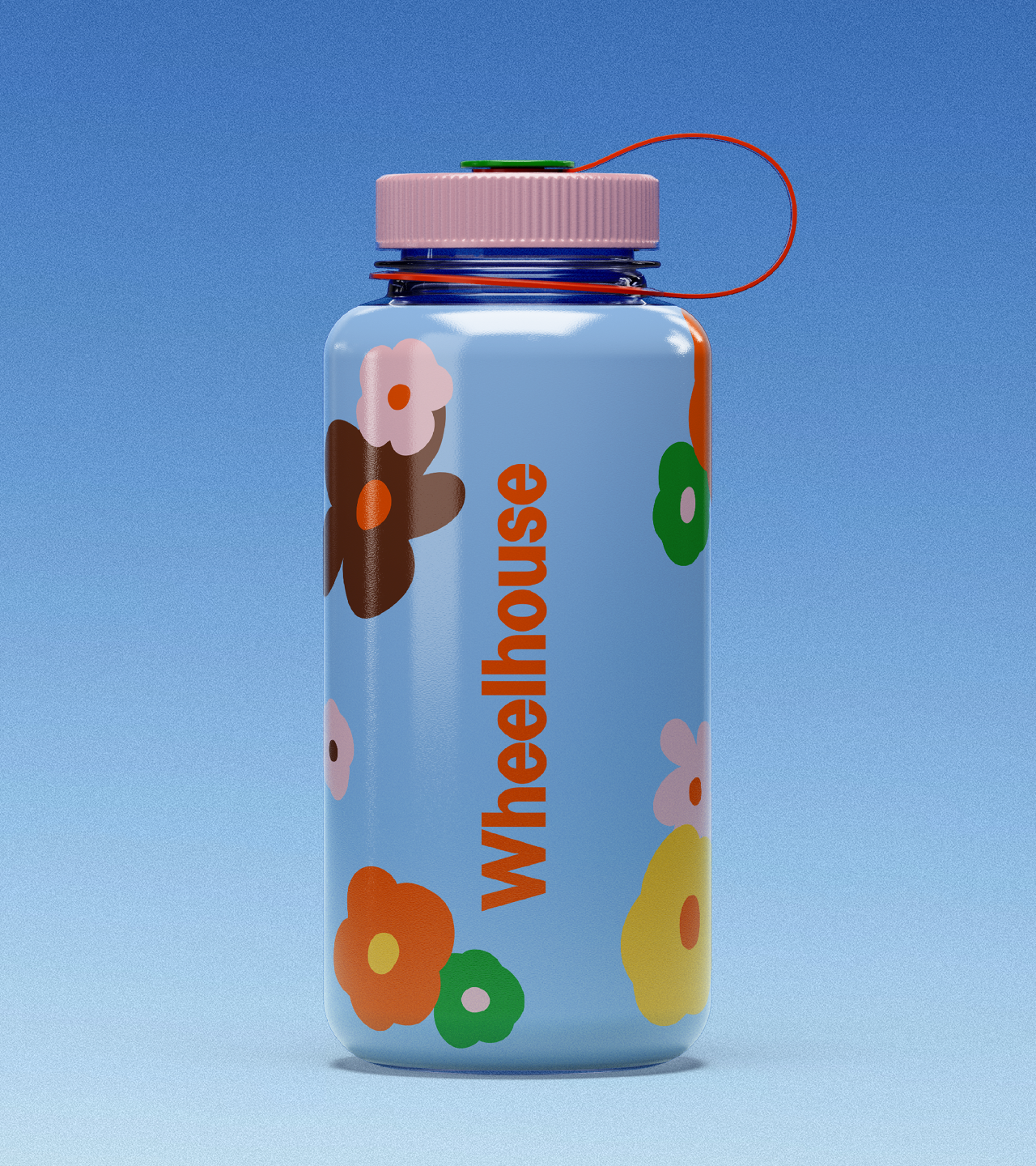
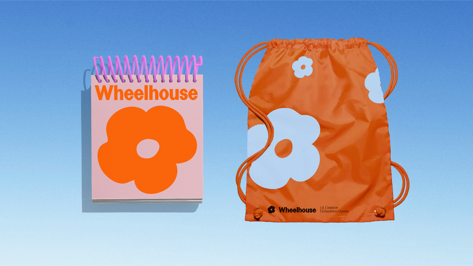
ABD created a creative strategy and brand identity built on simple, flexible forms that reflect the organization’s ethos. The final system uses a playful reinterpretation of a flower, evolving the original Wheelhouse mark, at the center, with radiating petals representing its many programs and relationships. The result is a brand that feels warm, communal, and alive: a place where learning is social, identity is co-created, and community is something we grow.
Project Scope
- Strategy
- Visual Identity
- Collateral
- Art Direction
- Brand Standards

Related Projects

Let’s build new worlds together For inquiries Hello@a-b-d.co

News Projects/studio updates/thoughts

We’re exploring how a branded scent can create an emotional connection and enhance memory recall. It can transform spaces into a more immersive and memorable experience.

Dreambound is refining brand positioning and evolving the visual identity for a national career-training platform. Our work spans strategy, design systems, and launch.