Trailborn Hotels Framing Epic America.
Framing Epic America.
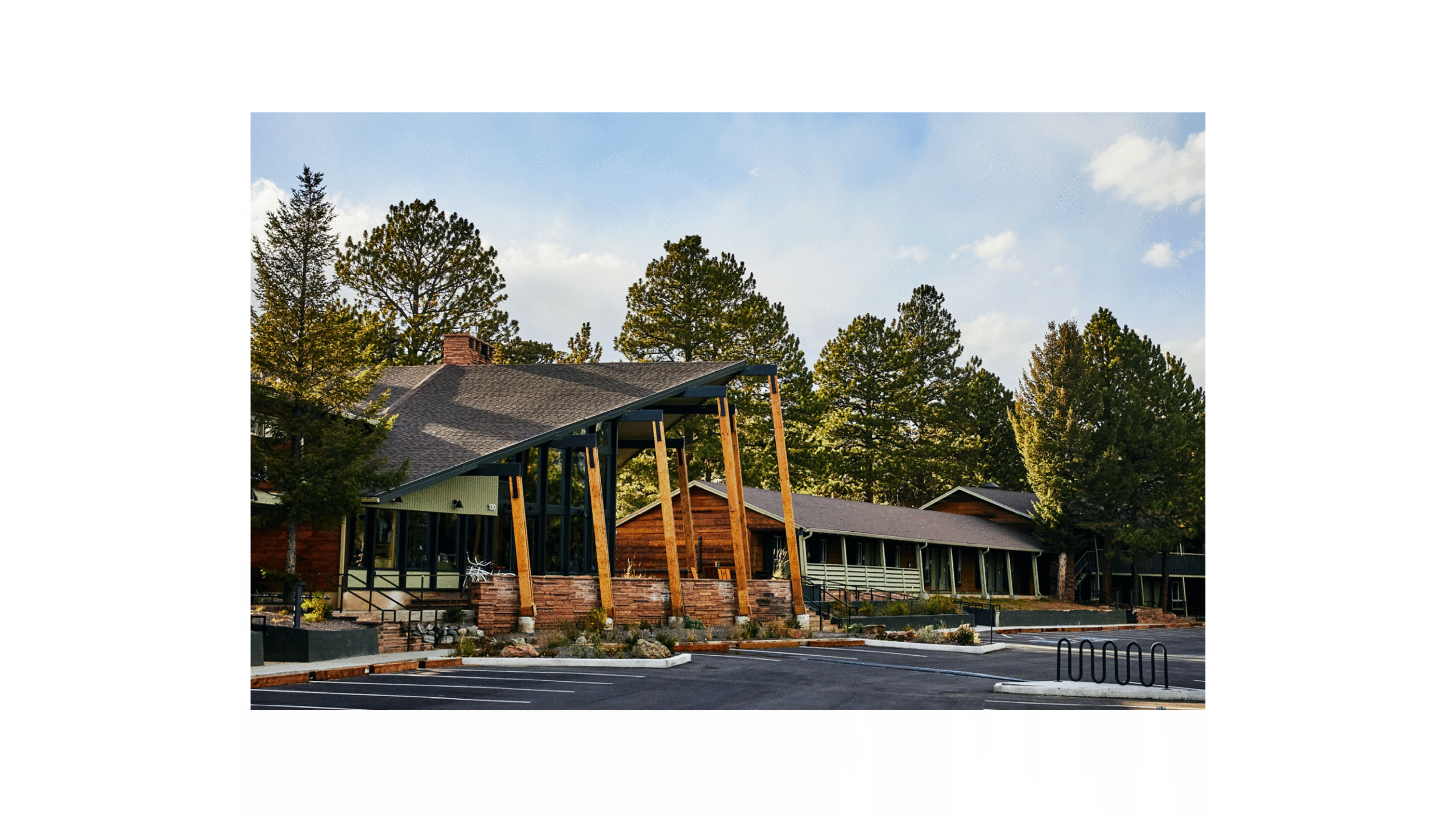
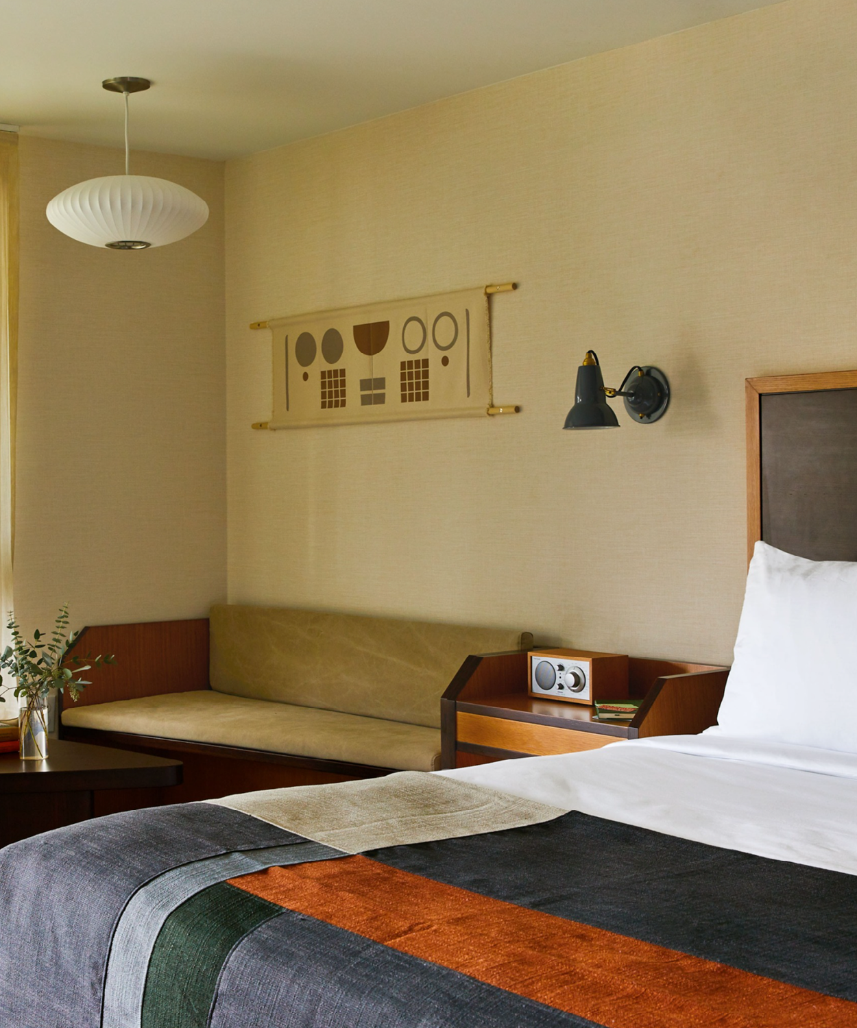
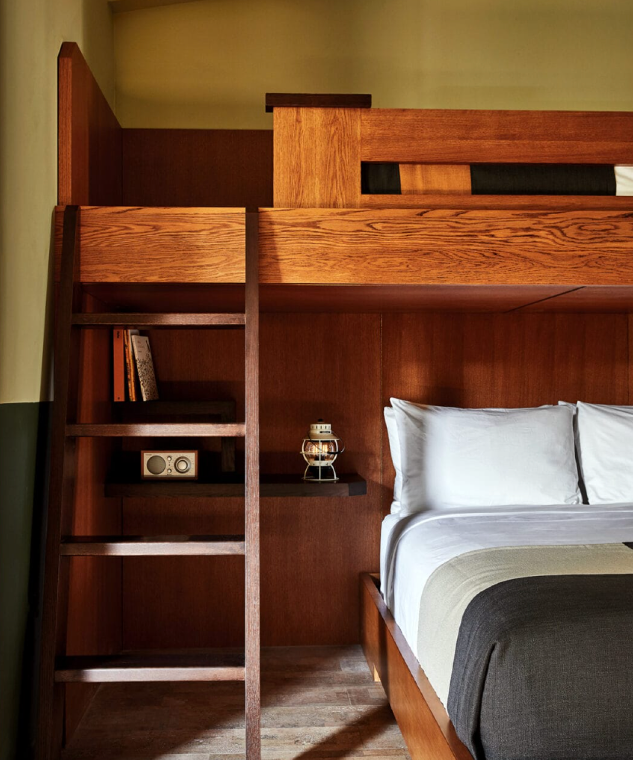
Trailborn Hotels embodies a fervent embrace of the modern American spirit, where breathtaking nature intersects with the warmth of small-town charm. It’s a place where communal pride is cultivated from grassroots efforts and where timeless stories are passed down through generations. Here, a touch of grit and weathered elegance allow the true magic to shine through.
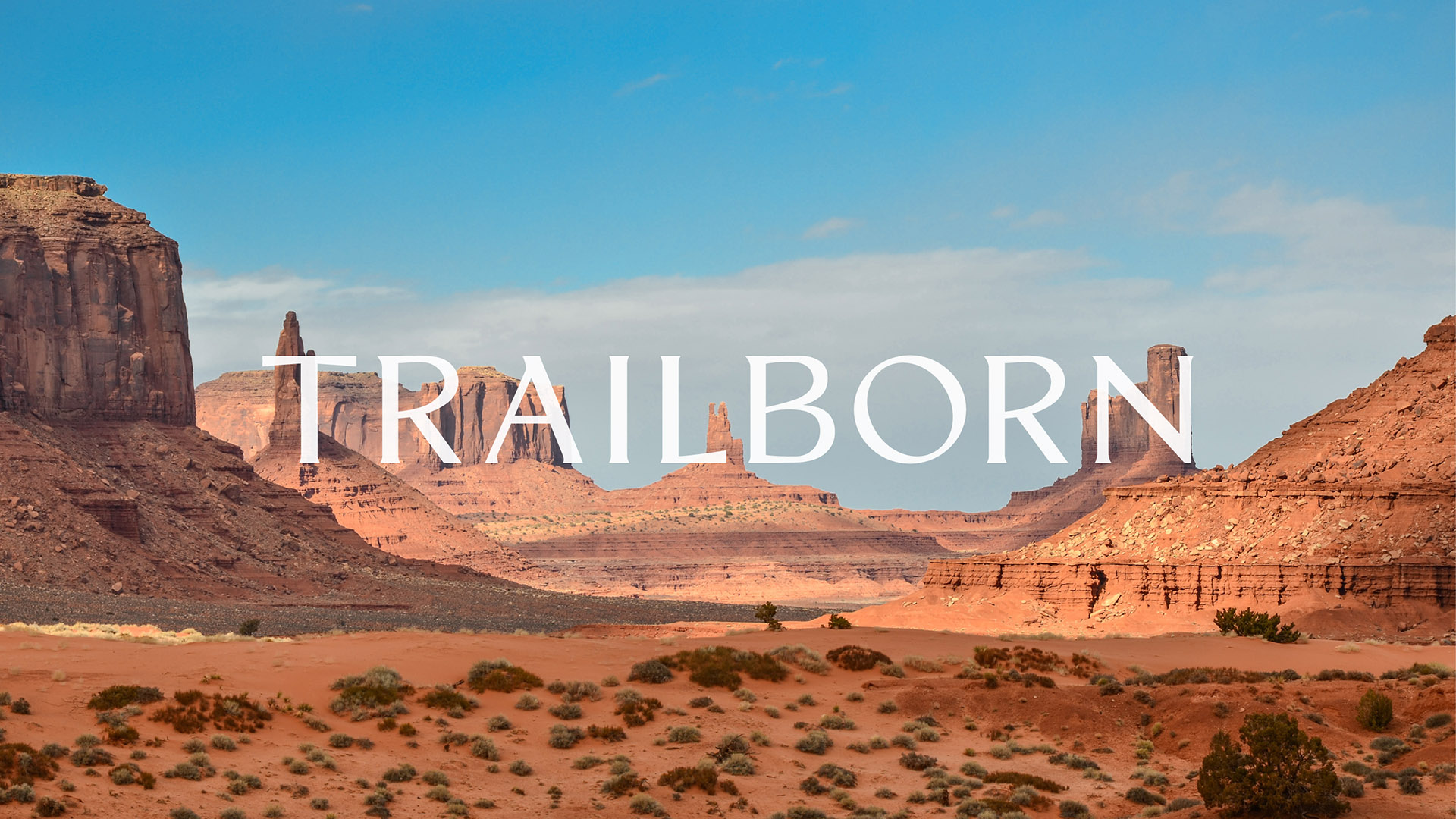
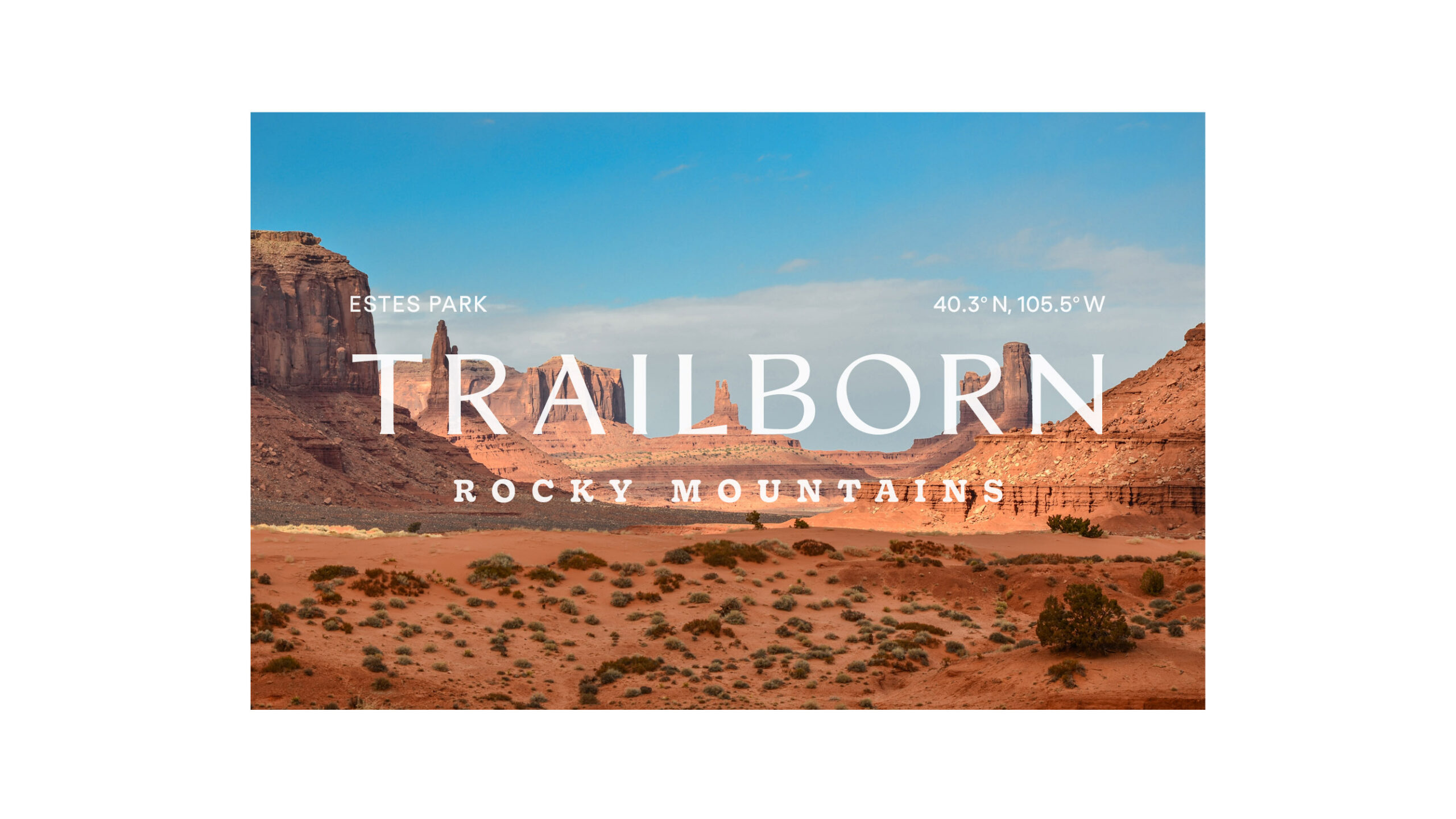
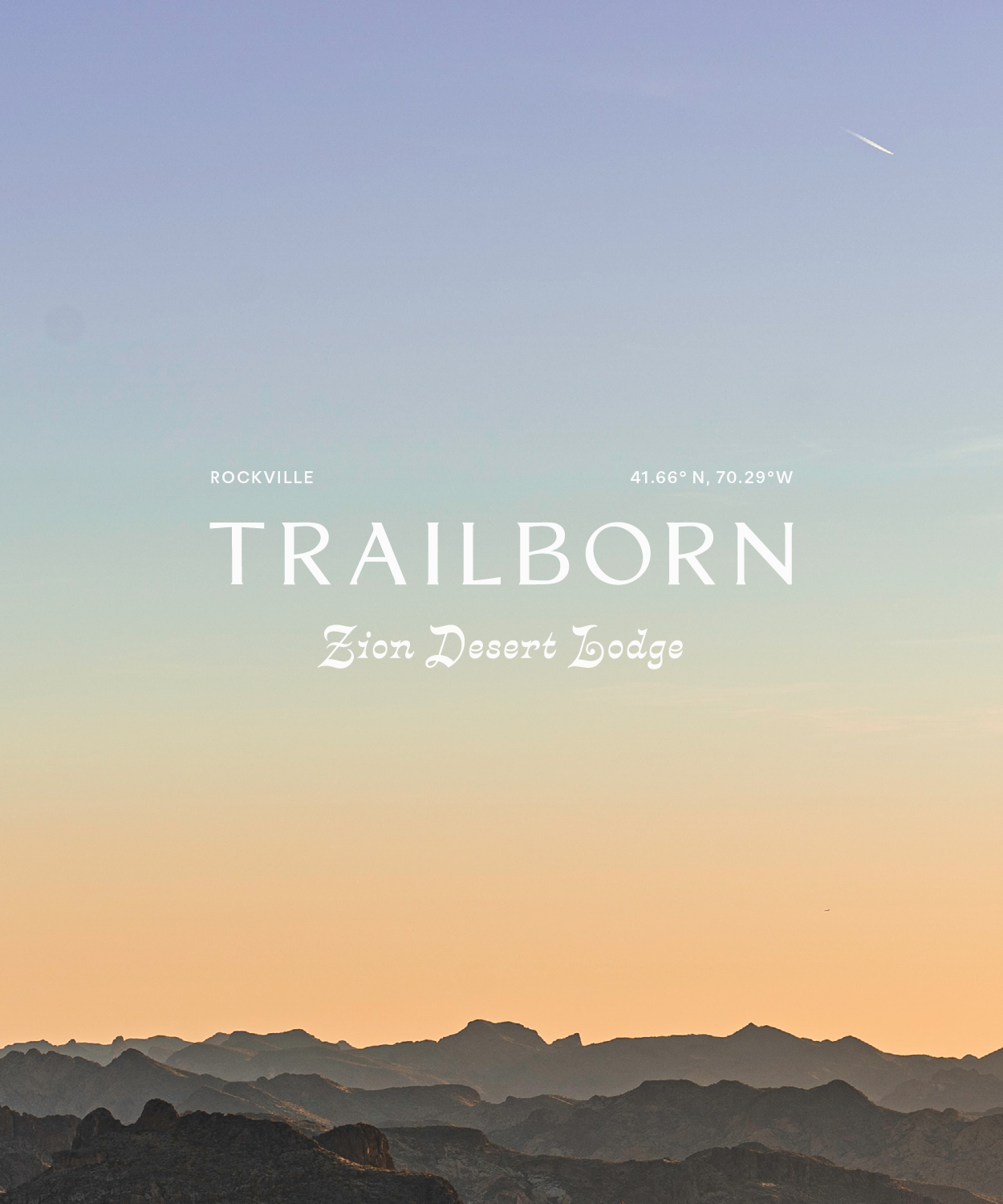
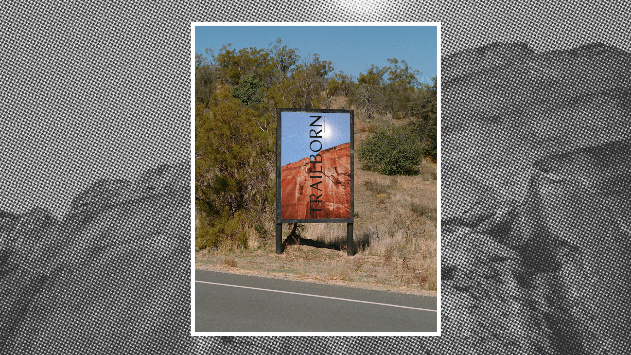
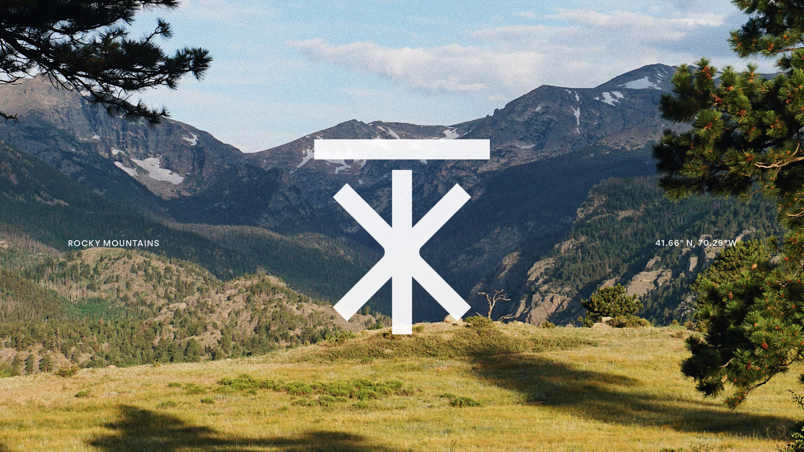
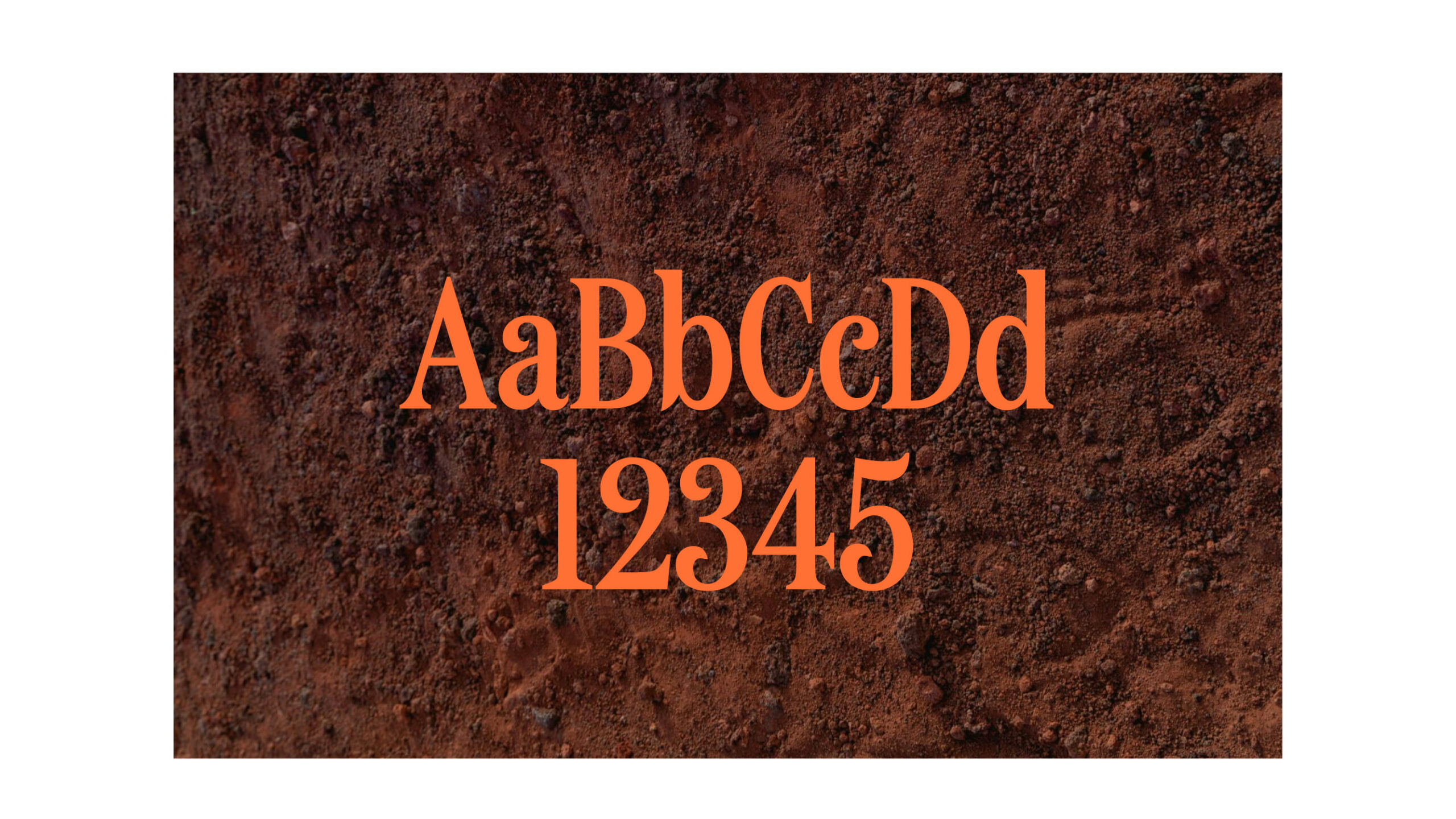
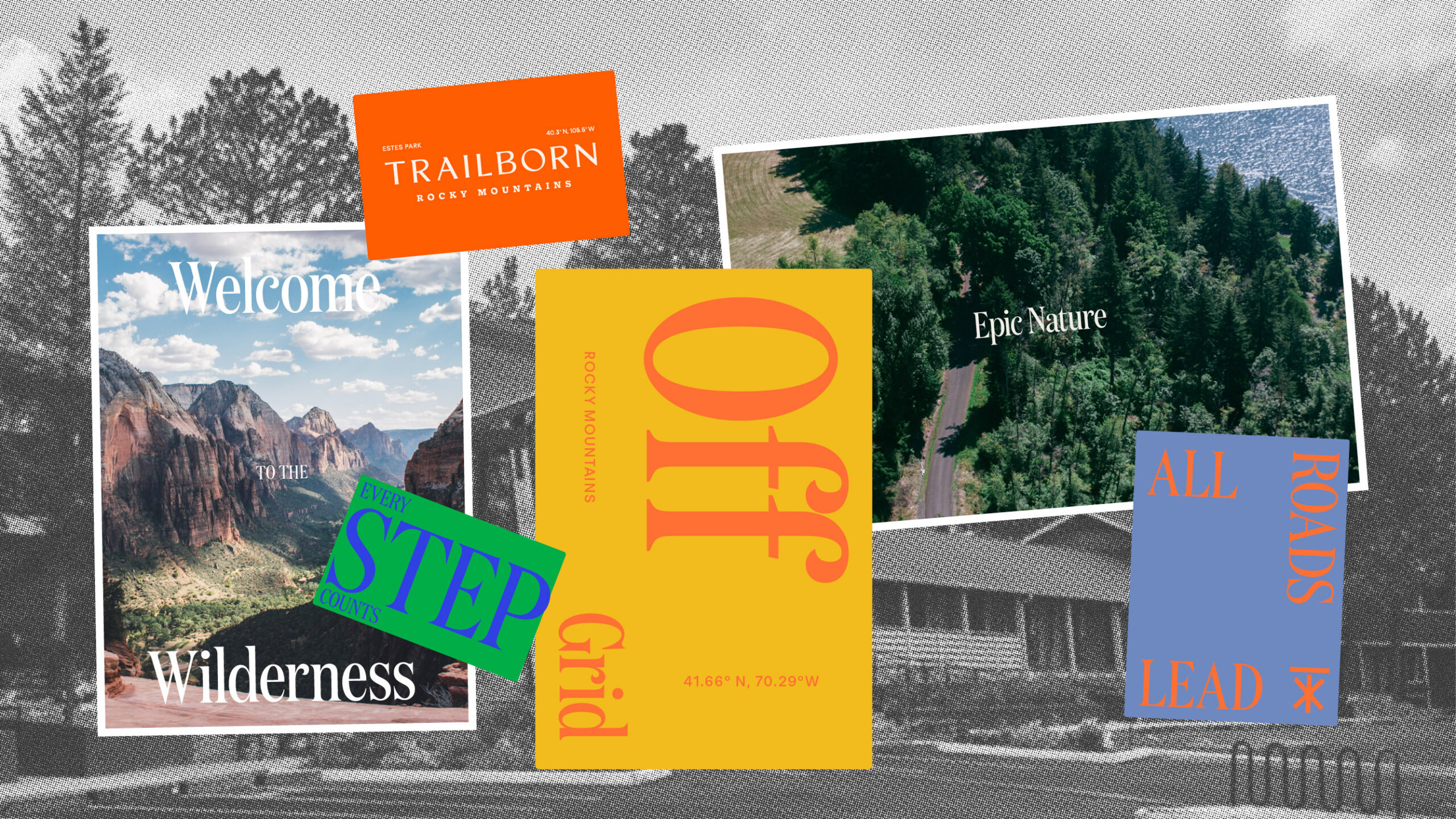
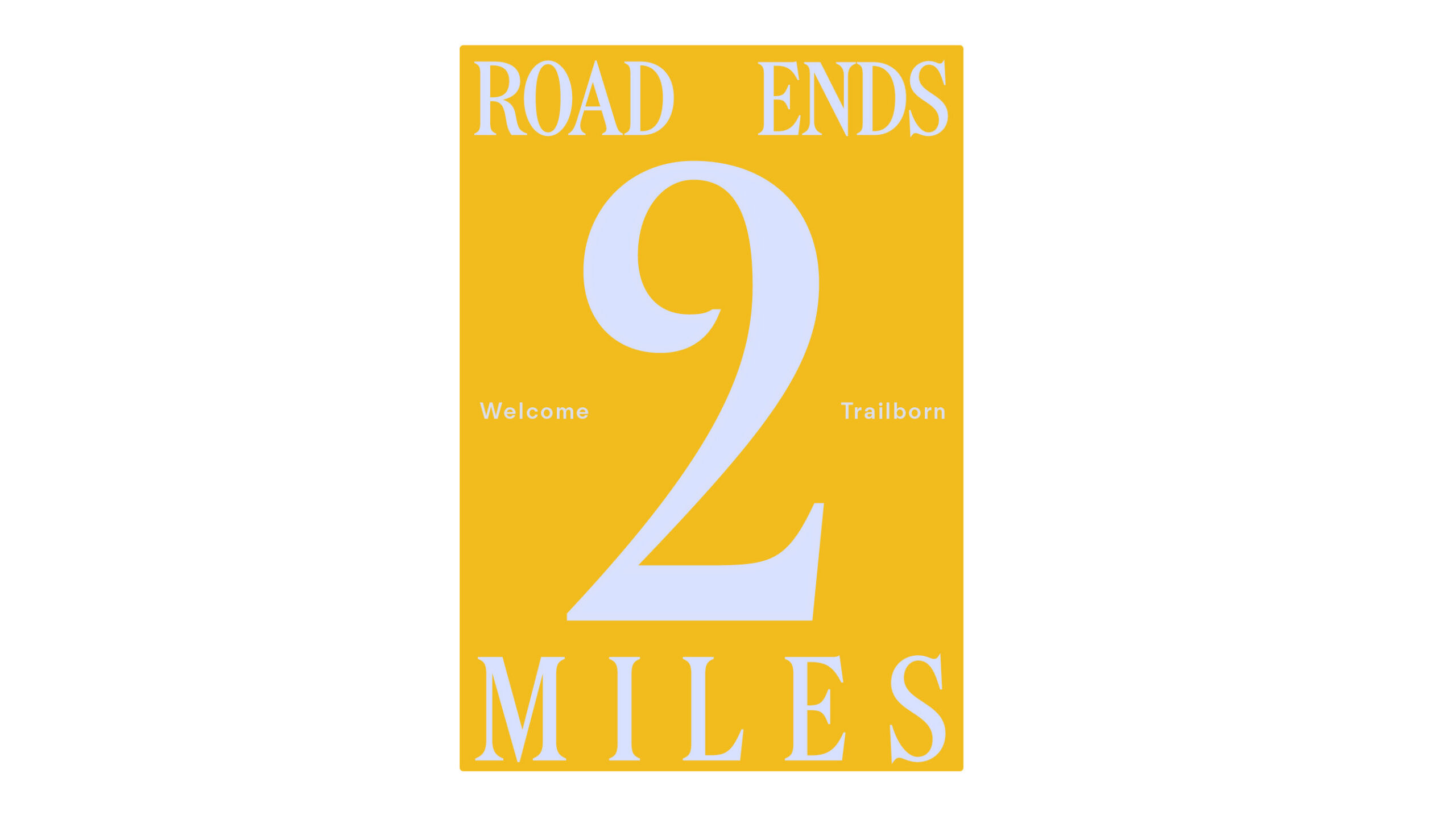
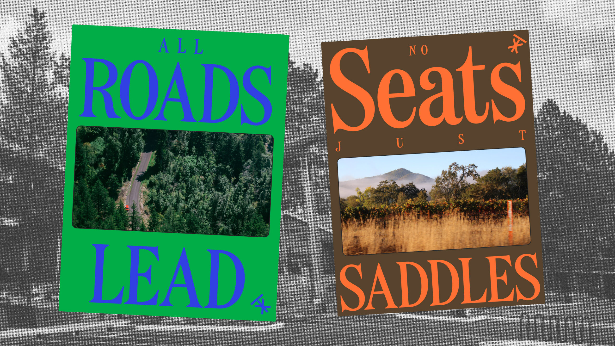
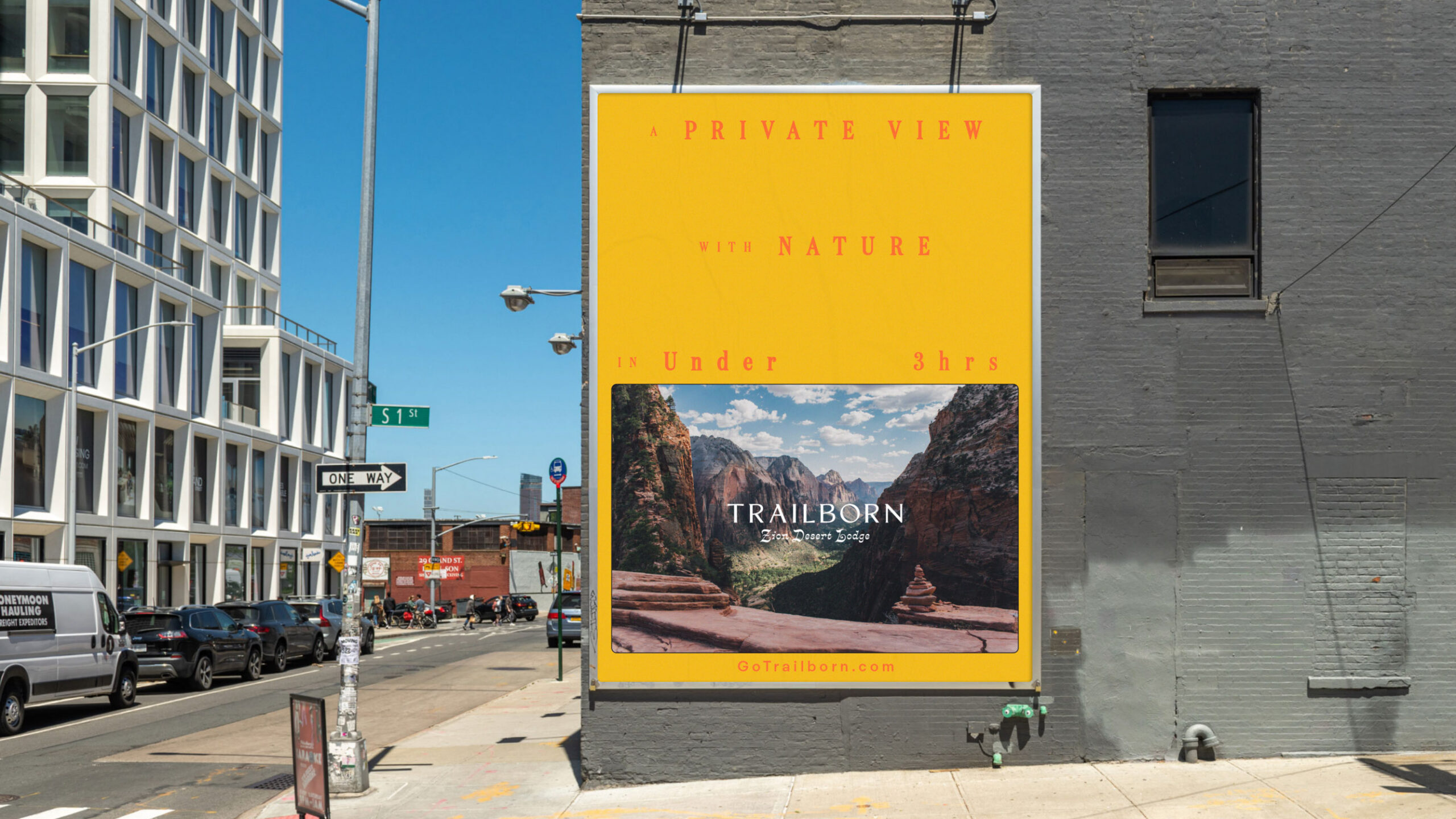
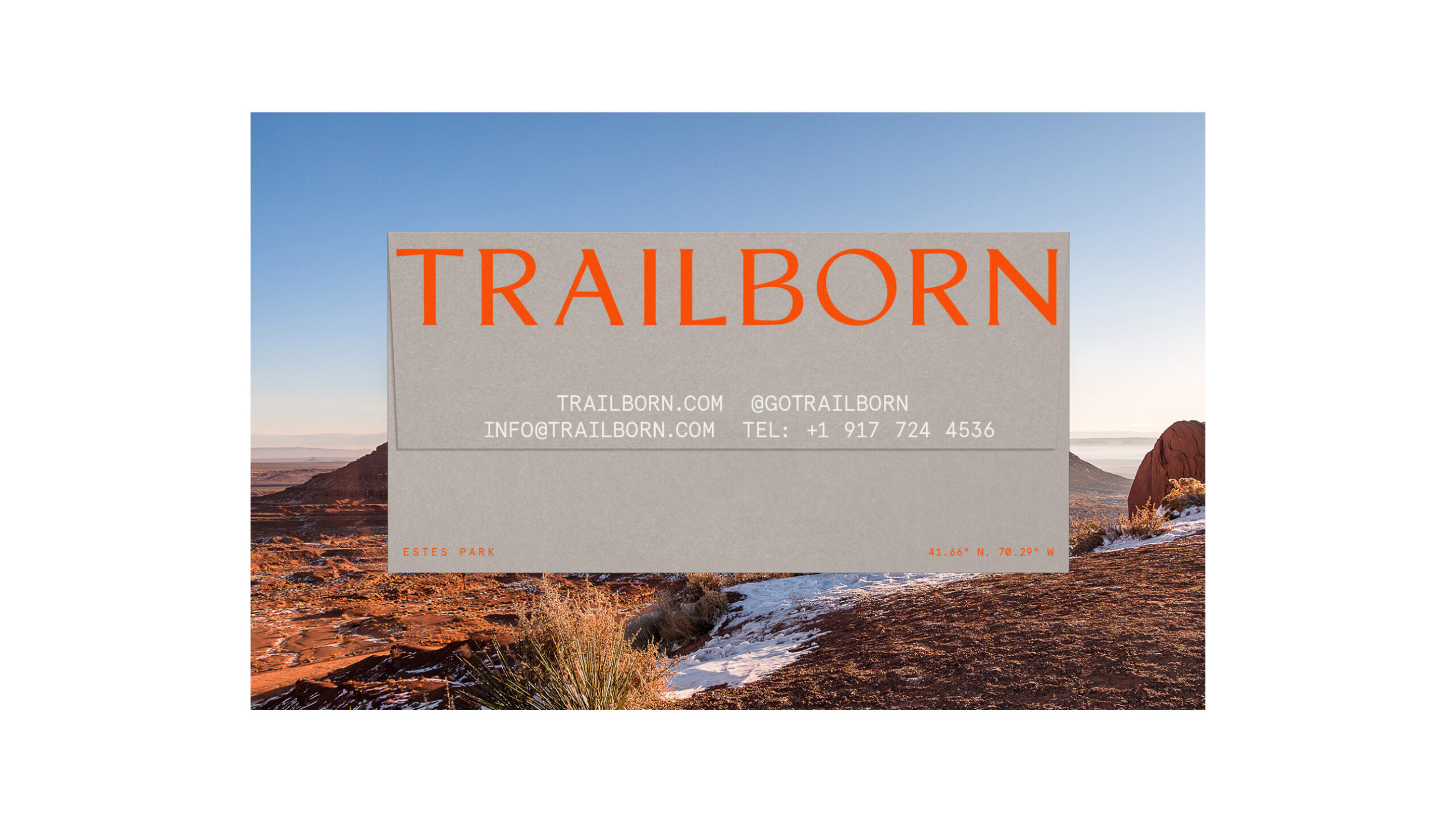
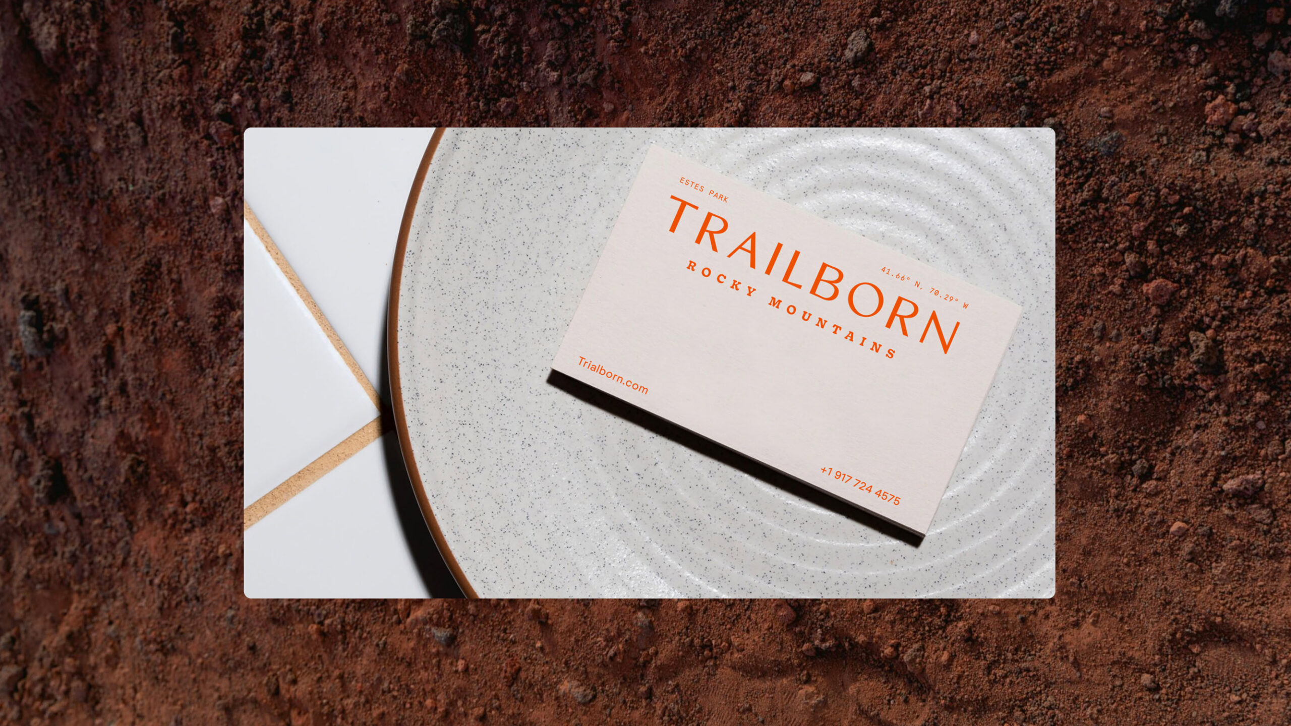
Driven by a longing to uncover the essence of real America, we crafted a brand that fosters a deep connection with nature and the unexpected. Our iconic logo takes the form of a trail marker, cleverly incorporating the letters “T” and “X” to signify the journey to off-the-beaten-path destinations. Paired with a bold typographic system, this symbol frames the majestic American landscapes and experiences, enhancing their beauty akin to natural masterpieces.
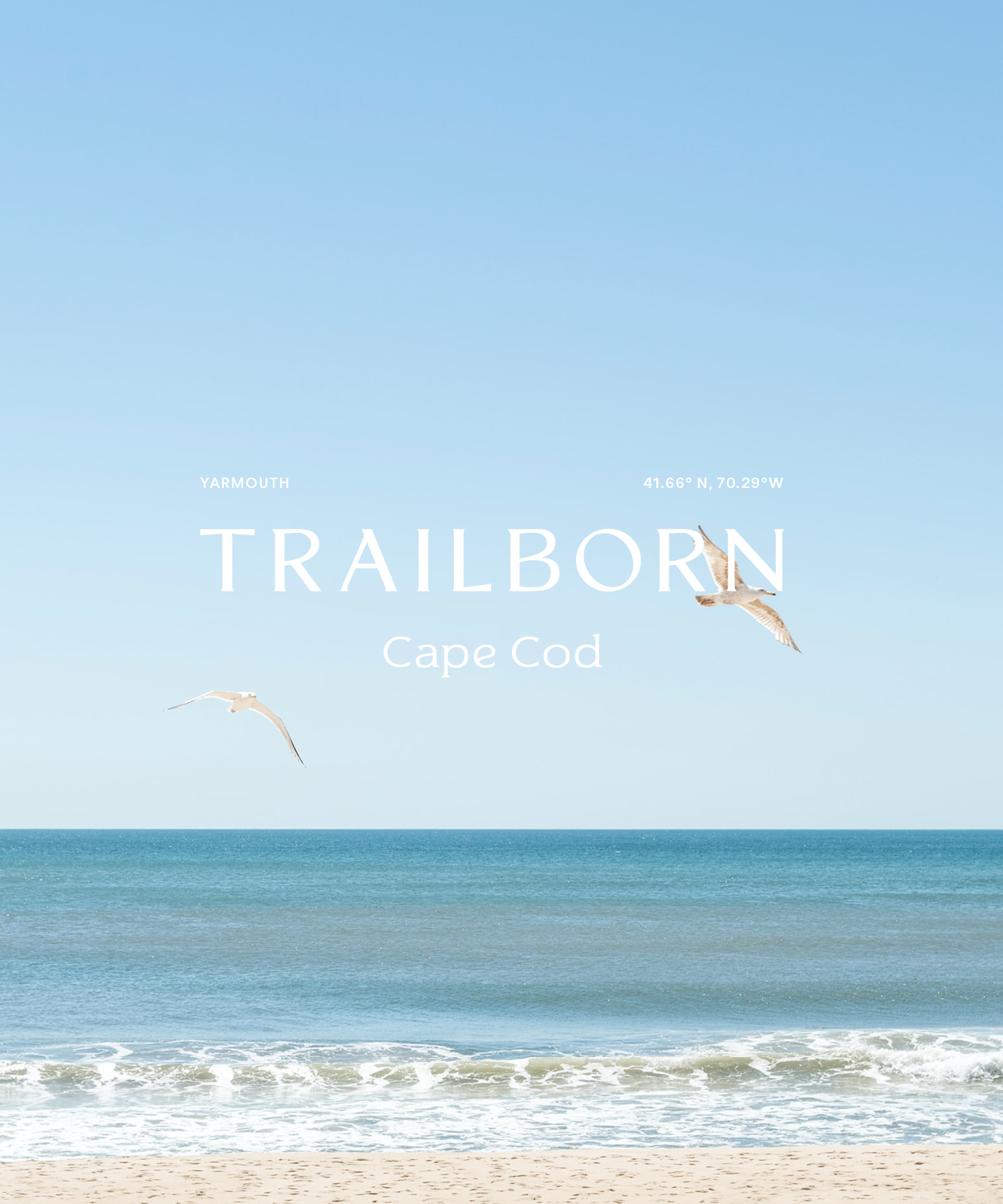
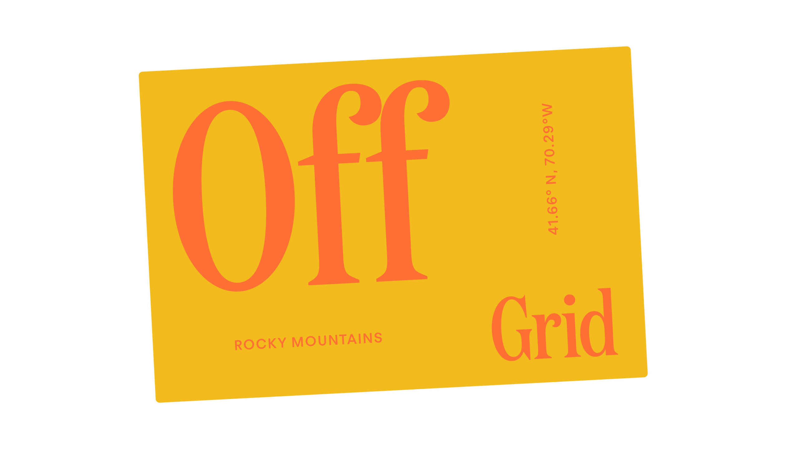
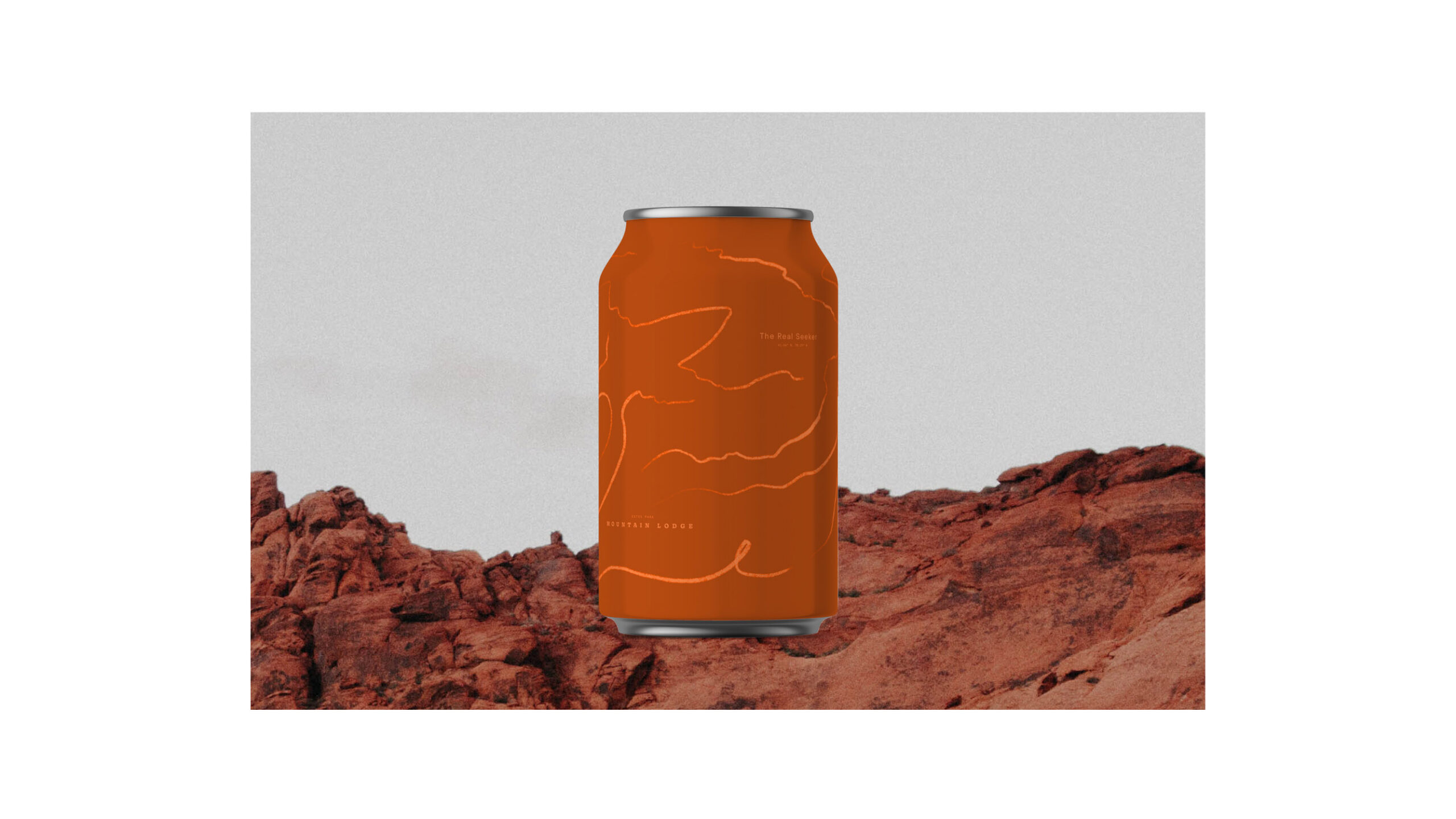
Each hotel’s location and personality are reflected in its unique typography styling, providing subtle yet distinct visual cues that make every destination truly distinctive.
Project Scope
- Positioning Strategy
- Naming
- Visual Identity
- Brand Guidelines
- Brand Collateral
- Art Direction
Collaborators
- Electric Bowery
- Chris Harder
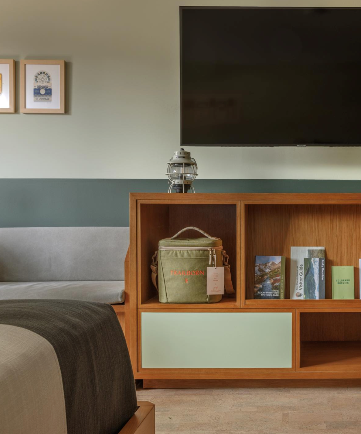
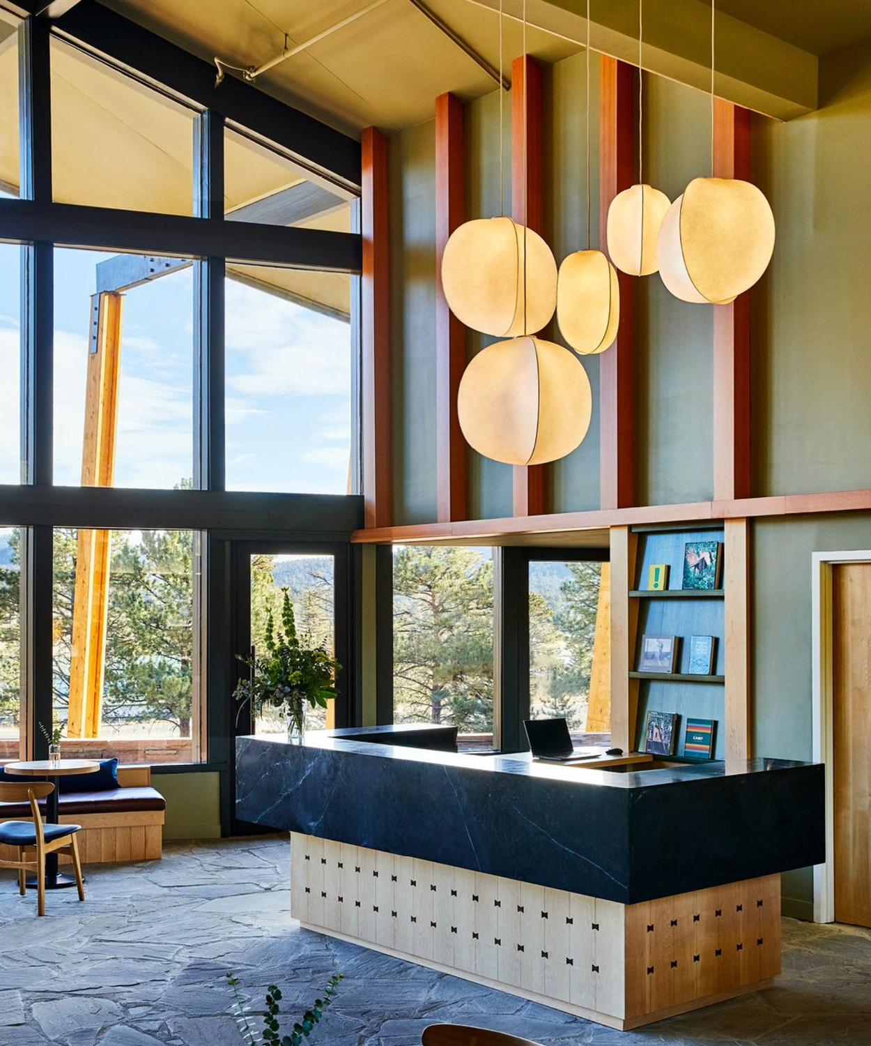
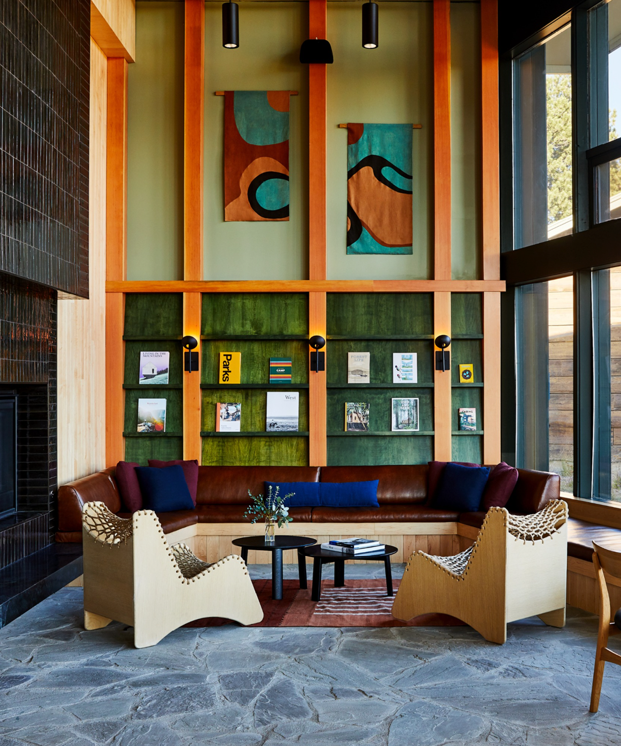
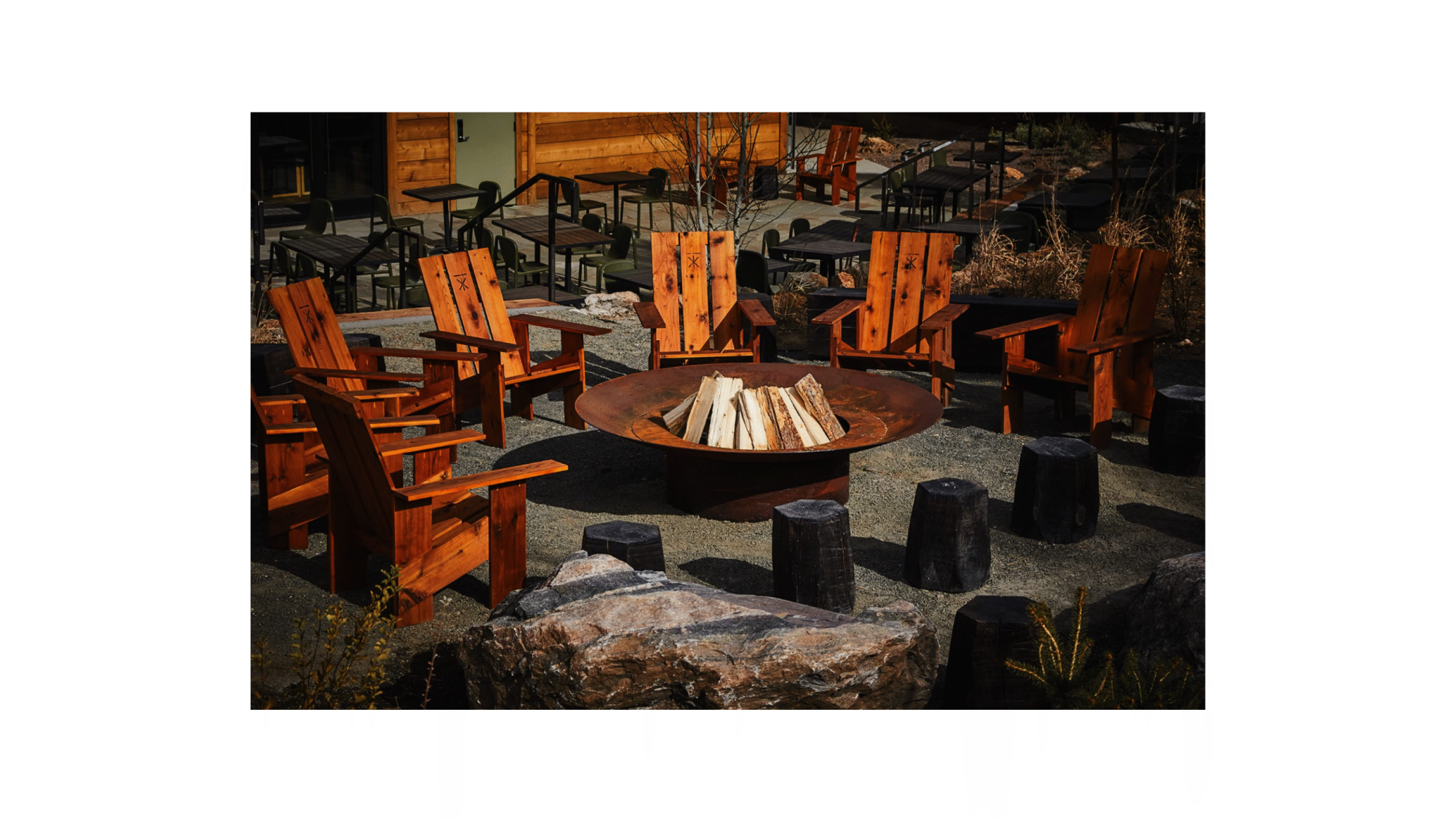
Our iconic logo takes the form of a trail marker, cleverly incorporating the letters “T” and “X” to signify the journey
to off-the-beaten-path destinations.



Let’s build new worlds together For inquiries Hello@a-b-d.co
News Projects/studio updates/thoughts
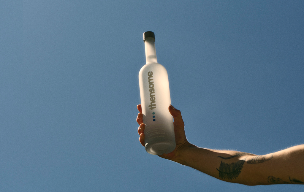
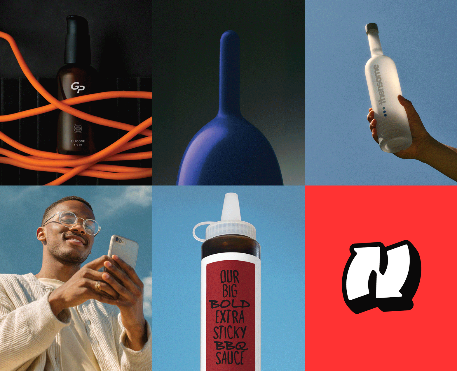
ABD partnered on the Thensome launch, shaping naming, brand identity, and packaging, while supporting go-to-market strategy and content development.
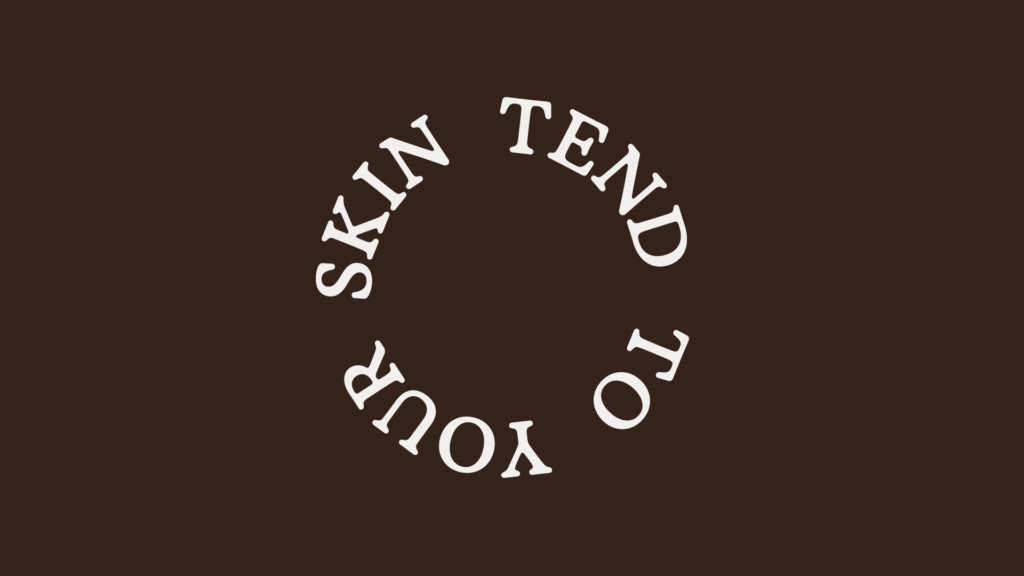
Work in progress: shaping a new skincare startup brand from strategy and positioning to visual identity, packaging, and launch approach. Coming soon.
We partnered with The Cosine, a lighting architecture firm, to define strategic positioning and refresh visual identity. Focusing on how light shapes space

